|
There is no question but the climate is warming.
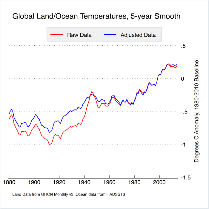
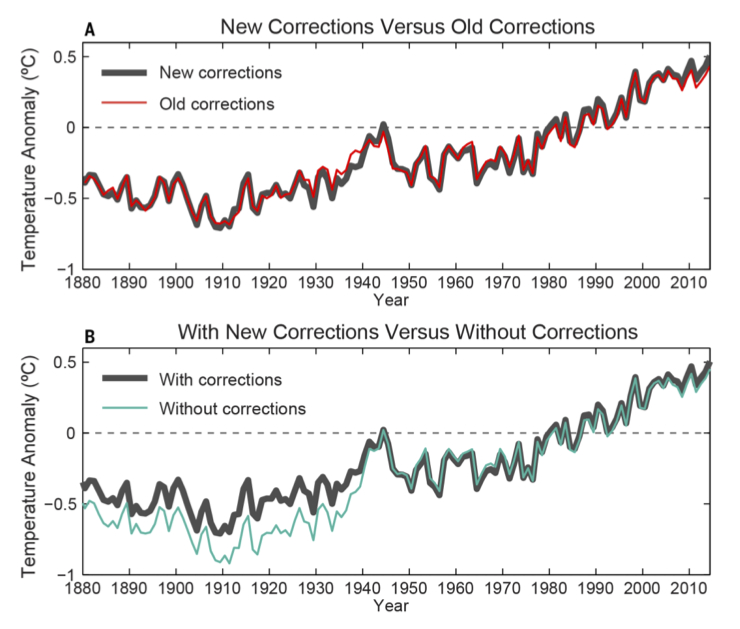
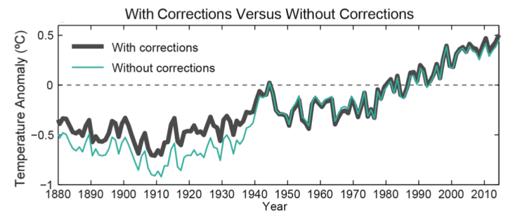
The adjustments made to pre-WWII temperatures, particularly in the USA, did cause official land temperatures rises to increase. But adjustments to above-ocean temperatures caused the opposite effect: reducing the apparent warming rate. The net result of ALL homogenisation adjustment globally was to REDUCE the apparent warming:
Source
NOAA have been making more corrections recently which only really impact the years just prior to 1940, as you can see in the upper graph below. See RealClimate.com for details.
The lower graph shows the effect of ALL corrections, confirming that the net effect is to decrease the apparent warming. Not what you would expect if they were trying to fake global warming.
RealClimate.com
RealClimate.com
Generalised Climate Model Equation.
Generalised Climate Model Equation
model = c1(Log(CO2+1)/Log(2))
+ c2E
+ c3A
+ c4Cos(2Π(T+c5)/c6)
+ c7Cos(2Π(T+c8)/c9)
+ c10Cos(2Π(T+c11)/c12)
+ c13R
+ c14S
+ c15V
+ c16

|
|
|
|
Since I am now addressing the nit-picker par excellence, I suppose I should clarify my use of 'know' as meaning 'believe to a high degree of certitude'.
An element of all belief comes from what others have told us, but in my case I have put quite a lot of work into the subject, analysed the data from all angles I could think of, and that analysis work is the main basis for my certitude. In particular, I have tried very hard to model the last 130 years global temperature with and, just as importantly, without considering CO2. A good way to test a model is to use about ľ of the data to create the model, then use it to forecast the remaining Ľ. So I built a model for 1881-1980 using solar radiation, oceanic oscillations, sulphur aerosol, and volcanic data, and used it to predict what would happen in the tears 1991 to 2010. The result:
Not very good as a prediction for the 30 years following the analysis, is it? But if we include CO2 in the analysis, we get:
Work is in progress on improving the prediction of short-term oceanic movements like AMO and ENSO, which drive most of the short-term variations. It can be done reasonably well for 30 years, but there remains a bug which smooths forecasts too much too quickly.
|
|
Yes there were, and it's worth having a look at the temperature graph again to see why.
After WWII the temperature did indeed seem to be in decline, causing some scientists to conjecture that
that we might be in danger of another ice age. But even by 1970, after 30 years of decline,
for every scientific paper published about a coming ice age there were SIX predicting warming due to increased carbon dioxide.
By 1980, with temperature still in the doldrums after 40 years, virtually ALL papers were predicting a CO2 forced rise.
Now that was a genuine climate forecast, made in the face of 40 years of temperature decline, predicting that it would start to rise soon.
There is no denying the accuracy of that forecast. These people knew what they were talking about then, and they do now still.
|
|
(Click for link) |
I cannot agree that the ups and downs in the last 15 years yet indicate that warming has stopped, nor that there has been cooling since 1998.
1998 was one of the peaks but it looks like 2010 might surpass it as did 2005. The decade 2000 to 2009 contained 4 of the 5 hottest years
since temperature readings began. 1998 was the only one outside that decade. Since the 70s, the average for each decade has exceeded that of
the previous one. We shall have to wait and see what the average for 2010 to 2019 will be. Meanwhile, here's the very latest graph from NASA GISS:
|
|

(Courtesy skepticalscience.com)
|
It is a myth. The popular press seized on a scientific paper by
Rasool and Schneider (1971),
which said that IF industrial sulphate aerosols increased fourfold then the cooling effect would overwhelm the warming effect
of the CO2. In fact aerosols decreased because of the clean air acts enacted in most countries
at the time and warming was not overwhelmed. By 1976 Stephen Scneider was in the forefront of scientists predicting global
warming.
During the period 1965-1979 for every scientist predicting global cooling, six were predicting the global warming
that actually happened. But if you were a popular press editor trying to sell papers, what headline would do the trick:
"Ice age coming!" or "Earth to warm a few degrees"?
|
|

(Click for Skepticalscience.com)
|
We are discussing the global warming that has occurred since the 1970s, and what I said was quite correct: there has
been NO INCREASE in solar radiation during that period.
Certainly it is at a high level, but since the 70s there has been no increase to correspond to the rise in temperature.
Here is a very accurate graph from NASA showing solar radiation during most of the period.
As you can see, it wobbles up and down by about 0.1%, showing the well-known 11 year cycle, but
there is no systematic rise.
Scientists know that a prolonged change of 0.5% would profoundly affect the climate.
But it is worth noting that the present high value is only 0.2% higher than during the Little Ice Age.
|
|


(Click for NASA Earth Observatory)
|
Sorry Scott; I missed that request. I am surprised that you can't find any solar radiance charts. There is nothing
wrong with the wattsupwiththat version if that's what you prefer:
As you can see, there is no explanation there for the temperature rise since the 1970s,
though it might have contributed to the pre-1940 rise.
|
|

(Click for Watts Up With That?)

Astronomy and Physics
|
|
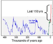
Current greenhouse gas levels are far higher than for the previous 650,000 years
The current atmospheric concentrations of carbon dioxide is 35% greater than pre-industrial levels. Methane concentrations have
increased by 250%. These dramatic increases in greenhouse gases are human-caused.
|
|
(Click for ZFacts.com)
|
So far as the warming period 1970s onward is concerned, it is overlooked for good reason: there has been no change corresponding to the
temperature rise.
Correlation may not prove causation, but complete lack of it rather puts the damper on things.
There is good reason to believe that cosmic ray variations do cause variations in low cloud cover and so affect climate, but the flux
in the short term depends almost completely on the solar radiation, and it slavishly follows the 11 year solar cycle,
so it is not useful as an independent predictor in the short term; it's simpler just to use solar irradiance.
|
|

Cosmic Rays (red) and Cloud Cover (blue). Click for Physicaplus.org.il.
|
|
However, cosmic ray flux coming into the Solar System does vary significantly and independently on a very long time-scale
as the Solar System orbits the rest of our galaxy, and there is
a persuasive evidence that it is a highly significant driver of long term climate cycles measured over hundreds of millions of years.
|
|

Click for Physicaplus.gov.il
|
The figure right shows the results of two sets of computer simulations of the global average surface
temperature of the 20th century using a particular climate model. In the first set, denoted by blue, only natural,
time-varying forcings are applied; these consist of variable solar output and “dimming” owing to aerosols produced by
known volcanic eruptions. The second set (in red)
adds in the man-made influences on sulfate aerosols and greenhouse gases.
The two sets of simulations diverge during the 1970s and have no overlap at all today, and that the observed global temperature
also starts to fall outside the envelope of the all-natural simulations in the 1970s.
|
|

Click for Physicaplus.org.il article
|
I wonder why you picked 2007? Did you honestly think that 2007
represented a halt to the decline of ice?
Everybody knows that it goes up and down but that there is an overall trend as well.
Here is the most recent graph:
Back in 1986 you could have seen the ice increase a bit and say "look - the ice is increasing FACT!"
And you could have said it again in 1992, 1995 and 2000. And you would have been just as wrong as you
are now.
|
|
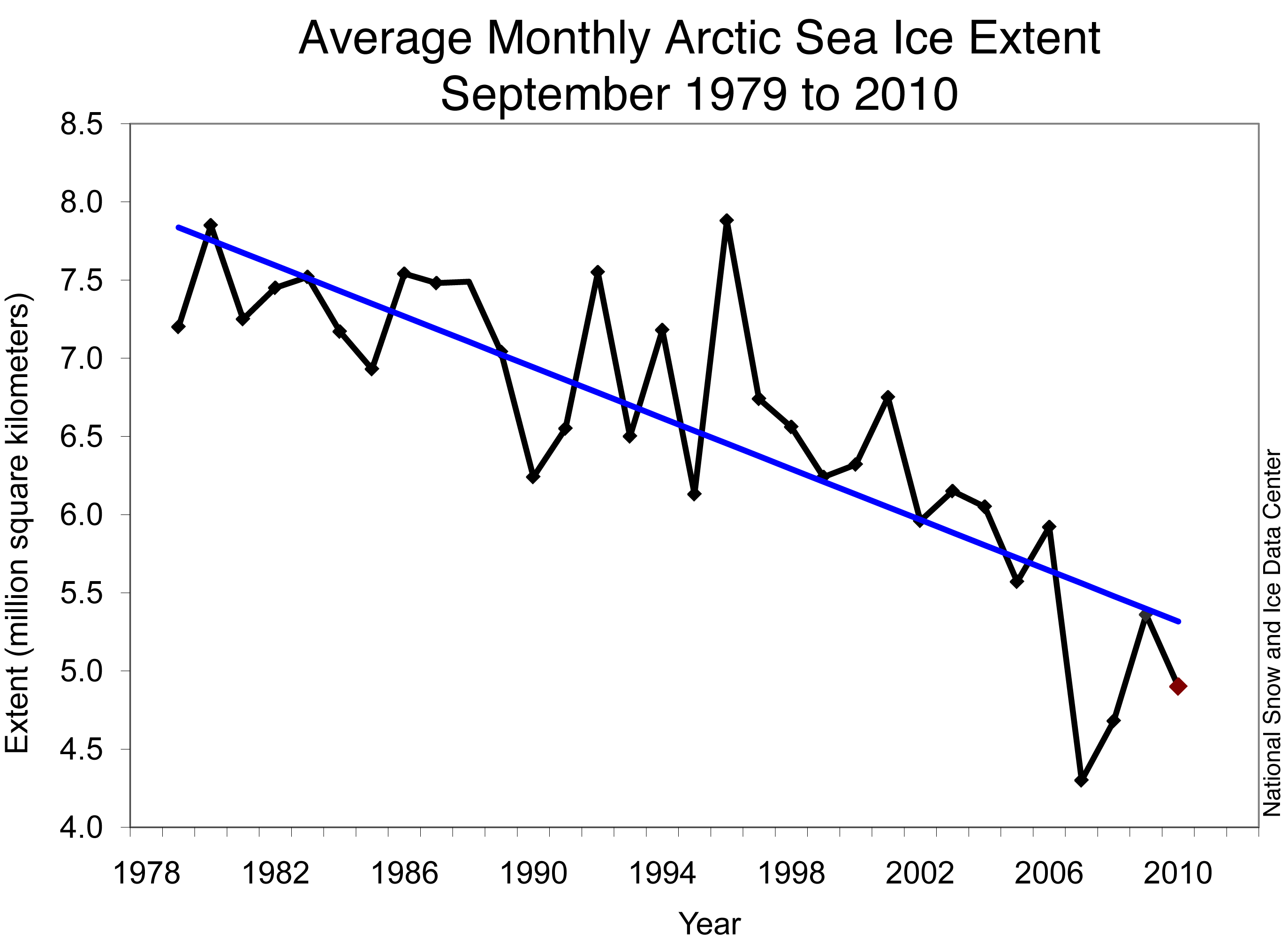
Arctic Sea Ice News
|

|
|
|
For the MOC to be causing 40 years of warming the oceans would have to be releasing heat energy to the atmosphere throughout that period and so the oceans would have to be cooling. But the oceans are warming too, indeed it is estimated that 90% of the extra heat energy that the Earth has absorbed has gone into warming the oceans.
The Oceans do have a dramatic effect - eg El Nińo - but this typically reverses itself within an erratic 2-8 year cycle. A 100 year cycle would be needed to explain 40 years of warming.
The record year 1998 coincided with a record El Nińo event.
|
|


|